The Problem
Customers were having a hard time deciding which Merchant Services system they wanted. They were not clear about the product features. This led to lower conversion rates for Merchant Services.
Discovery
I spent several sessions with the Product Manager going over user data that had already been collected, including:
- Conversion Rates
- Customer Feedback Surveys
- Feedback from Customer Service Specialists
From this data, I concluded the main issue customers were having was not a lack of understanding of the system features, but how the features directly addressed their needs, making it more difficult for them to choose a system.
I also spent a significant amount of time learning how each Merchant Services system worked, and helping to refine the application process.
Decision
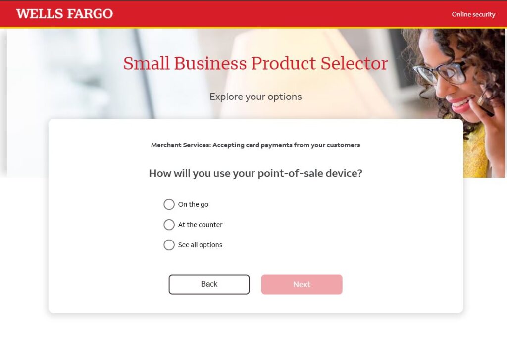
Upon reviewing the user feedback, it was determined that the best way to overcome these issues was not to clarify the system’s features, but to create a system where users could directly address their needs. It was decided to create a questionnaire for users that could utilize data from their specific needs to recommend a system based on its features. For instance, if a customer needed to process cards on the go, we could direct them to systems that offered mobile features.
Design
I determined the basic features of each product and grouped like features together (mobile, freestanding, complete POS system, etc.). I then tagged each product with the appropriate features, and created a table of them for development.
Then, the questions and answers were written. I worked with a staff copywriter to create the proper voice for our brand, while making the questions as clear as possible for the user. A decision tree was also created to plan out the logic that would need to be used for each question.
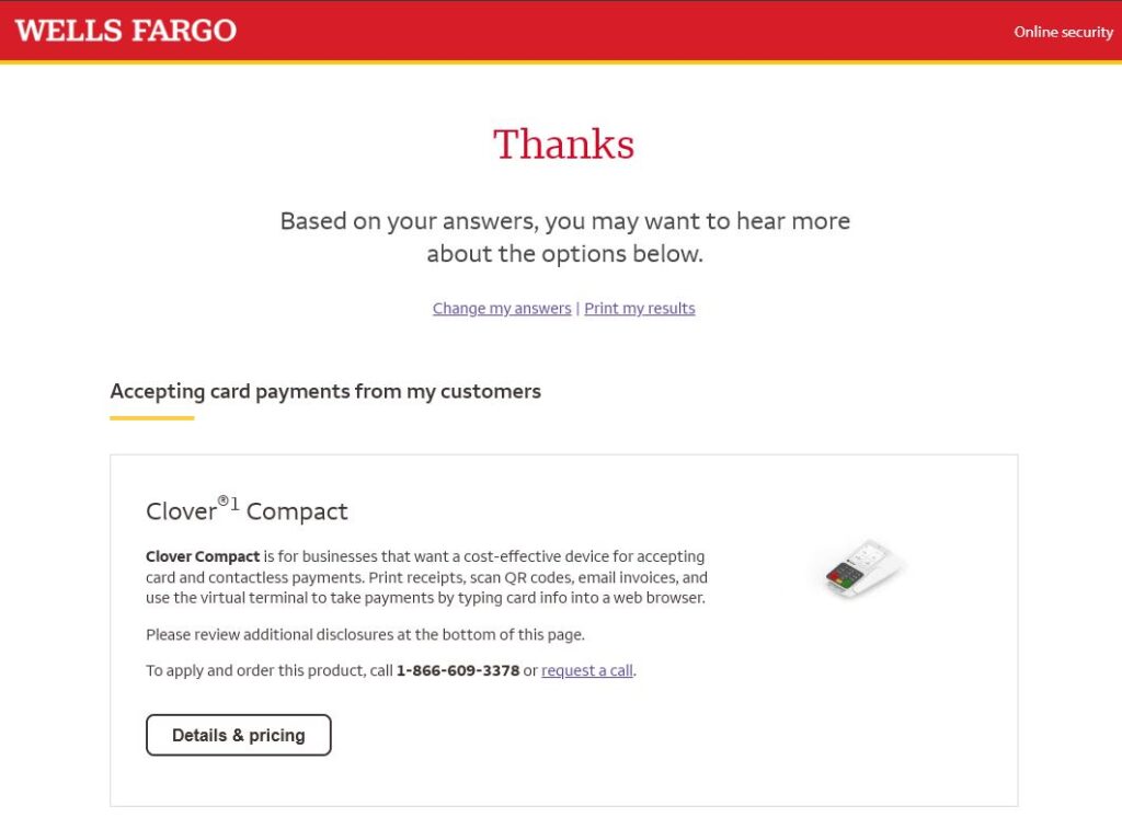
As for the UI, it was decided to go with a more conversational style in presenting the questions to users. Each page on the questionnaire had a single question for the user to answer, and depending on their answers, the appropriate product would be presented on the results page, with either a link to apply or a number to call to speak to a representative.
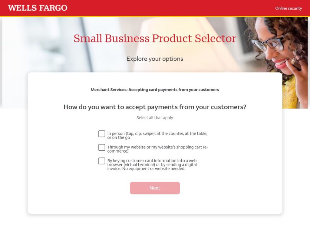
The results page also gave the user the ability to change their answers if they wanted different results, or to print out their answers, in the event they wanted to do more research and come back later to purchase.
Deliver
The initial design files were created in Figma and then delivered to our developers. A working high-resolution prototype was also created to demonstrate the desired interactions and to help answer any questions about the final design. To communicate the logic required for each decision, the features table and decision tree were also handed off to the developers.
Results
The results were positive: a slight increase in conversions was reported. However, the most significant results were the anecdotal feedback we received from customer service representatives. They not only reported a decrease in user frustration, but they also ended up using the tool themselves while on the phone with potential customers. It made it a lot easier to assist people and, in turn, made it easier to convert them into customers.
